Wednesday, May 2, 2012
Commercial
Monday, April 9, 2012

Tuesday, April 3, 2012
Commercial Ideas
1. Person is sleeping and a thought bubble pops up showing a dream and then it fades with people watching it in a movie theater.
2. Person explaining that they had a epic dream but doesn't feel like explaining it, so he pops in a dvd for people to watch his dream.
3. Dream song plays while words/sentences pop up describing features and benefits of DreamReal. At the end, DreamReal logo is shown.
4. Narrator asking viewer about problems with "you had to be there" stories or dreams and showing off features of DreamReal and how every dream description you've ever had to tell can be seen easily on TV.
5. Person falls asleep, another person yells "action", the dream begins, the narrator yells "cut", and then the end scene is people watching the dream on screen.
Monday, April 2, 2012
Commercial Critiques
I chose this commercial because it focused on dreaming which is what my commercial will be focusing on, so I wanted to see different techniques used. This commercial is more fun and humorous and is definitely directed towards the male audience. I think the objective of this commercial was targeted at men to show that the Kia isn't the sportiest car however it does have fun features that men can relate to. I do not think it is as effective as it could be because the only features that were really shown about the car in the commercial is speed.
This advertisement is for Target and it is showing off products that are needed to make your summer the best summer yet. It really is showing the viewer a lot of products but it is not overwhelming. It is a fun commercial that both children and adults can identify with. Overall, I think the techniques used in this commercial are effective; especially at the end when the narrator says, "Make summer fun. Expect more, pay less".
This commercial has animation in it with the two m&m's. For the most part, people already know what m&m's are so there is really no need to explain what they are or what benefits come from them. This is definitely a fun and humorous commercial that people of all ages can enjoy. The purpose of this commercial is probably to remind people about the candy and make people crave it.
This is also an animated commercial about Wheat Thins. It is using Family Guy characters to create that celebrity appearance. This advertisement is more geared towards the younger generation; I am pretty sure older adults would find this rather annoying and be confused. The content of the two characters is irrelevant to the product however the slogan in the background makes it tie more together by saying "Do what you do" with Wheat Thins.
Monday, March 26, 2012
Brochure


I tried to keep my design consistent with my business card and letterhead by instilling the film strip in the brochure. The font is also the same consistency on the brochure as it is on both the business card and letterhead.
Wednesday, March 21, 2012
Letterhead

I tried to use the same color font as my business card. I also wanted to keep the small squares in my layout designs to keep both my business card and letterhead connected.
Monday, March 19, 2012
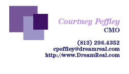
Final Business Card
I made my logo the back and then I used the same color scheme for my wording as I have for my logo. I also took the squares from the logo and made them into a border to give it more of a design that looks like it could be part of a film strip also.


Wednesday, March 14, 2012
Business Card Thumbnails


I made five different backs with and five different sides with information. I tried to keep all of the lettering the same font and I wanted to keep the color scheme the same so it would be identifiable. I wanted to incorporate my logo on the business card because that is necessary most of the time when dealing with business cards and corporate identity.
Saturday, March 10, 2012
Corporate Identity
1) What is your business?
We are a company that allows you to watch your dreams.
2) Describe your business in one sentence
We have created innovative technology that allows you to view your dreams on DVD.
3) Who is your target audience?
Our company looks to attract people of all ages (usually older than 13) who do watch movies and want to remember or watch exactly what they dreamed.
4) Who are your competitors?
DreamReal is a new innovative company with a product and service unlike any other company.
5) What makes them better/worse than your product/service?
Since we do not have any competition, we are focused on improving our product so that if competition does come into our market in the future, we will be ahead of the game with new and improved technology.
6) Do you currently have an identity?
No
No
7) (If your answer to #6 is no, skip this question) What do you like about it and what don’t you like about it?
Why is this important? Even if you plan to change the logo entirely, it’s good to keep an inventory about what specifically worked and didn’t work about your previous design in order to inform the new one.
8) How do you want your image to be seen in two years?
We want this company to be seen as a trusting business that has created quality entertainment.
9) If your company was an animal, what animal would it be and why?
Our company would be an owl because it is a nocturnal animal that is on the prowl during the night while other animals are sleeping.
10) If your company/brand was a person, who would it be and why?
Steven Speilberg because he is known as being the greatest film director of all time.
11) If your company/brand was an object, what would it be?
A high tech video camera that looks old fashion to give you a feel of the past (your dreams) and the present (watching your dreams).
12) If your customer was a cartoon character, who would it be?
Sleepy from the Snow White and the Seven Dwarfs. He is constantly sleeping so I am sure he would have a lot of dreams that he would want to watch.
Wednesday, February 22, 2012
Lyrical Collage

I chose the lyrics from Man in the Mirror by Michael Jackson. I made a cat looking into a mirror and it sees its reflection as a lion. I tried my best to create shadows and make everything flow together. The main tool I used for this project was the polygonal lasso tool. I figured I would stick with warm colors to make it look more appealing to the eye.
Wednesday, February 15, 2012


Monday, February 13, 2012


My Final Logo
I decided to go with this logo because it is simple, sleek and is still readable at a smaller size. This logo is the company's name and then a watermark in the background is a real of film. I chose the color purple because it reminds me of colors associated with dreaming.
Monday, February 6, 2012
I haven't decided exactly which logo I want to use yet. Each logo is pretty simple and very geometric for the most part. I chose purple as a color because to me, purple seems like a "dreamy" color. I wanted it to look pleasing to the eye as well as make sense so that people could have a general idea of what my company is. Any suggestions?
Monday, January 30, 2012


Monday, January 23, 2012
Logos by the Pros
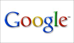
Google has a logo that is simple and known by pretty much everyone in the world. Because it is so well known, the company's product doesn't need to be explained. The colors are playful and pleasing to the eye. I think it brings a happy and fun sense of feeling. I do not think it is aimed toward any gender in specific because it doesn't seem overly masculine and the colors are neutral to men's and women's tastes. I do think the colors chosen were good to use because they appeal to both men and women as well as children.

This company is known for changing its logo for special occasions and is still recognizable to its viewers as Google. I posted one of the transformed logos to show that it is still evident that Google is the company being advertised.

I like this logo because it is very creative and it is obvious as to what this company's specialty is. This logo seems to focus on symbols because it looks like a sun is around the coffee cup which could represent the sun rising in the morning. I like how they incorporated a rooster into the coffee steam to symbolize early mornings. I also think the colors that were chosen for this logo are relevant because they are colors that are similar to the color of coffee. The color scheme is a nice choice and I like how they do not have a lot of different colors. If they had too many, I think it would be distracting and take away from the rooster. I think it appeals to adults mainly but I think the cartoonish style could appeal to children as well. The only thing that is a little tricky to read is "Breakfast" under the larger font. I think the company should consider changing the font because it looks like the word is being crossed out. Overall, I really like this logo and it makes me want to find this cafe.

This logo is sleek and simple. It is evident that it is a bike company and it seems like they would be high end bikes. It gives me a sense of seriousness. I could see people with a lot of money looking into this company. Children would probably not be drawn to this advertisement, because it isn't as playful as the other logos previously mentioned. The colors seem more masculine so I think this logo would appeal more to men than women. I think the colors chosen for the logo work and give a nice edge over other bicycle companies. Also, the form of the bike looks like the infinity symbol which goes along nicely with the look and the message of "unlimited".

What stood out to me the most with this logo is how the company played with the word "Sinful." To give it that devilish edge, they added horns to the "S" as well as a devil's tail to the "f." I think their logo really gets the point across and it makes me curious to know what kind of treats they have to offer that are that indulgent. The colors they chose are understandable; red being the color of sin and the edibles is brown to represent chocolate. This logo will probably appeal to younger adults (men or women) over children, but I'm pretty sure any child who sees a chocolate covered strawberry would want the product.

This is another logo that is well known by most people. Puma is a company that can still be understood by customers if only the puma is represented as the logo of their product. The puma in this logo is in action which can symbolize the company's products of active wear and sports apparel. The color of the logo varies; this happens to be a logo design to show the company is taking steps to go green. I think the color works for the logo and makes it stand out. Also, the color is green which can worn by men or women so it really isn't gender biased. The jumping puma may attract children towards the products. The logo is fun and playful and when I see it it makes me have an urge to get active.
Sunday, January 22, 2012
Logos in the Making
1. JetGo: Jet Pack Back Pack that will get you there fast!
Logo: Backpack that looks like the bottom of a rocket ship or a jet; The world with a jet pack flying around it.
2. Shop3D TV: A 3D TV where if you see something you want on TV, just reach into the TV and grab it! Payments are made monthly with your cable bill.
Logo: TV with with someone walking out of it with shopping bags.
3. FlashBack: A Stopwatch that allows you to control your own time. You can freeze time, go back in time, or kick it in the future; now time waits on everyone!
Logo: The face of a watch that has the rewind symbol, stop, play and fast forward symbol.
4. ZappApp: An App for your smart phone that allows you to zap any large items and make them pocket size so you can take them on the go wherever and whenever you want!
Logo: Hands holding a miniature phone.
5. DreamWheel: Watch all of your dreams on video!
Logo: A video camera that projects DW.
6. EduCandy: Candy that will keep you educated for a lifetime! Comes in different flavors and different subjects. The amount of time you want to be smart depends on how much candy you're willing to consume!
Logo: Use candy to create a lightbulb and EduCandy is written in the bulb.
Wednesday, January 18, 2012
And So The Journey Begins
My name is Courtney Peffley and I am currently a junior at The University of Tampa. My concentration is marketing and I am minoring in advertising. From this class I hope to gain a greater understanding of computer design and to be able to know how to use the different programs. I have always wanted to learn the different softwares and I am excited to get started!
Subscribe to:
Posts (Atom)