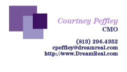
I made five different backs with and five different sides with information. I tried to keep all of the lettering the same font and I wanted to keep the color scheme the same so it would be identifiable. I wanted to incorporate my logo on the business card because that is necessary most of the time when dealing with business cards and corporate identity.
Wednesday, March 14, 2012
Saturday, March 10, 2012
Corporate Identity
1) What is your business?
We are a company that allows you to watch your dreams.
2) Describe your business in one sentence
We have created innovative technology that allows you to view your dreams on DVD.
3) Who is your target audience?
Our company looks to attract people of all ages (usually older than 13) who do watch movies and want to remember or watch exactly what they dreamed.
4) Who are your competitors?
DreamReal is a new innovative company with a product and service unlike any other company.
5) What makes them better/worse than your product/service?
Since we do not have any competition, we are focused on improving our product so that if competition does come into our market in the future, we will be ahead of the game with new and improved technology.
6) Do you currently have an identity?
No
No
7) (If your answer to #6 is no, skip this question) What do you like about it and what don’t you like about it?
Why is this important? Even if you plan to change the logo entirely, it’s good to keep an inventory about what specifically worked and didn’t work about your previous design in order to inform the new one.
8) How do you want your image to be seen in two years?
We want this company to be seen as a trusting business that has created quality entertainment.
9) If your company was an animal, what animal would it be and why?
Our company would be an owl because it is a nocturnal animal that is on the prowl during the night while other animals are sleeping.
10) If your company/brand was a person, who would it be and why?
Steven Speilberg because he is known as being the greatest film director of all time.
11) If your company/brand was an object, what would it be?
A high tech video camera that looks old fashion to give you a feel of the past (your dreams) and the present (watching your dreams).
12) If your customer was a cartoon character, who would it be?
Sleepy from the Snow White and the Seven Dwarfs. He is constantly sleeping so I am sure he would have a lot of dreams that he would want to watch.
Wednesday, February 22, 2012
Lyrical Collage
I chose the lyrics from Man in the Mirror by Michael Jackson. I made a cat looking into a mirror and it sees its reflection as a lion. I tried my best to create shadows and make everything flow together. The main tool I used for this project was the polygonal lasso tool. I figured I would stick with warm colors to make it look more appealing to the eye.
Wednesday, February 15, 2012
Monday, February 13, 2012
My Final Logo
I decided to go with this logo because it is simple, sleek and is still readable at a smaller size. This logo is the company's name and then a watermark in the background is a real of film. I chose the color purple because it reminds me of colors associated with dreaming.
Monday, February 6, 2012
I haven't decided exactly which logo I want to use yet. Each logo is pretty simple and very geometric for the most part. I chose purple as a color because to me, purple seems like a "dreamy" color. I wanted it to look pleasing to the eye as well as make sense so that people could have a general idea of what my company is. Any suggestions?
Subscribe to:
Posts (Atom)


