Courtney Peffley's Journey of Beginning Digital Arts
Wednesday, May 2, 2012
Commercial
Monday, April 9, 2012
Tuesday, April 3, 2012
Commercial Ideas
1. Person is sleeping and a thought bubble pops up showing a dream and then it fades with people watching it in a movie theater.
2. Person explaining that they had a epic dream but doesn't feel like explaining it, so he pops in a dvd for people to watch his dream.
3. Dream song plays while words/sentences pop up describing features and benefits of DreamReal. At the end, DreamReal logo is shown.
4. Narrator asking viewer about problems with "you had to be there" stories or dreams and showing off features of DreamReal and how every dream description you've ever had to tell can be seen easily on TV.
5. Person falls asleep, another person yells "action", the dream begins, the narrator yells "cut", and then the end scene is people watching the dream on screen.
Monday, April 2, 2012
Commercial Critiques
I chose this commercial because it focused on dreaming which is what my commercial will be focusing on, so I wanted to see different techniques used. This commercial is more fun and humorous and is definitely directed towards the male audience. I think the objective of this commercial was targeted at men to show that the Kia isn't the sportiest car however it does have fun features that men can relate to. I do not think it is as effective as it could be because the only features that were really shown about the car in the commercial is speed.
This advertisement is for Target and it is showing off products that are needed to make your summer the best summer yet. It really is showing the viewer a lot of products but it is not overwhelming. It is a fun commercial that both children and adults can identify with. Overall, I think the techniques used in this commercial are effective; especially at the end when the narrator says, "Make summer fun. Expect more, pay less".
This commercial has animation in it with the two m&m's. For the most part, people already know what m&m's are so there is really no need to explain what they are or what benefits come from them. This is definitely a fun and humorous commercial that people of all ages can enjoy. The purpose of this commercial is probably to remind people about the candy and make people crave it.
This is also an animated commercial about Wheat Thins. It is using Family Guy characters to create that celebrity appearance. This advertisement is more geared towards the younger generation; I am pretty sure older adults would find this rather annoying and be confused. The content of the two characters is irrelevant to the product however the slogan in the background makes it tie more together by saying "Do what you do" with Wheat Thins.
Monday, March 26, 2012
Brochure
I tried to keep my design consistent with my business card and letterhead by instilling the film strip in the brochure. The font is also the same consistency on the brochure as it is on both the business card and letterhead.
Wednesday, March 21, 2012
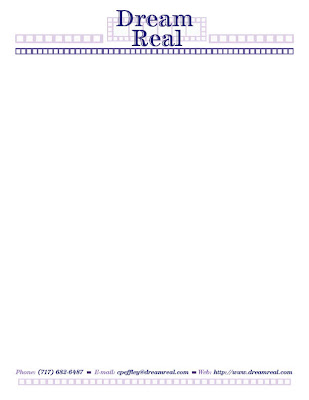
Letterhead
I tried to use the same color font as my business card. I also wanted to keep the small squares in my layout designs to keep both my business card and letterhead connected.
Monday, March 19, 2012
Final Business Card
I made my logo the back and then I used the same color scheme for my wording as I have for my logo. I also took the squares from the logo and made them into a border to give it more of a design that looks like it could be part of a film strip also.
Subscribe to:
Comments (Atom)


